Great Wave off Kanagawa
Katsushika Hokusai, Japanese, c. 1830-1832
(color wood-cut)
This entry is for the advanced student who enjoys learning about techniques in art—in this case, printmaking.
What is a print? A print is an image that is produced by a process which enables it to be multiplied. As such, printmaking requires an original design and a printing surface from which multiple copies of the original design are made onto a printing medium. A printing surface can be as simple as a cut potato, however, traditionally the most widely used materials have been wood, metal and stone. All printmaking techniques follow three basic steps. First, an original design is transferred to a printing surface in some manner. Second, the printing surface is inked. Third, through the application of pressure, an impression of the design is transferred from the printing surface onto multiple sheets of a printing medium, for example, paper, or sheets of satin or vellum—a parchment made from calf skin.
In this entry we will discuss a type of printing called relief printing. There are many types of relief printing. Essentially, relief printing involves a printing surface that stands in relief. For example, a wooden block or metal plate or piece of linoleum is cut in such a way that the design stands in relief above the sections that have been cut away. Ink is then applied to the printing surface. The design that stands in relief takes up the ink, and by applying vertical pressure, the design is transferred to a sheet of paper, for example.
One of the most important relief processes is woodcut. Woodcut printing was invented in China around the eighth century, perhaps earlier, and reached Europe through the Islamic world by the thirteenth century, at which point it was used to stamp designs onto textiles. Key to woodcut printing is the history of paper making. The earliest paper mills were founded in Italy in the late thirteenth century. However, it wouldn’t be until there was a supply of cheap paper, presumably in the second half of the fourteenth century, that the first prints on paper were made. Some of the earliest surviving woodcut prints that date from the late fourteenth century up through the mid-fifteenth century have sophisticated compositions, but in general the medium remained a minor art form and was used mostly for printing images onto playing cards and religious images that were sold at pilgrim shrines and fairs, or by peddlers.
Early woodcuts in Europe were made in the following manner. First, a wooden block was made from a plank of soft wood such as pear or beech or sycamore. The plank was sawn with the grain and planed smooth and then seasoned to prevent it from warping or cracking. Second, the artist drew his original design directly onto the surface of the wood or onto a sheet of paper which was then glued to the surface. Third, a professional wood cutter carved the design. The woodcutter used a knife similar to a penknife to cut away the wood from the sides of the lines of the design. If the original design required shading, the wood cutter carefully cut out parallel lines called cross-hatching. Large unwanted sections were cut away using chisels and gouges. Fourth, a print maker made the prints. The print maker dabbed or rolled ink onto the raised surface of the wood. He then stamped the surface directly onto paper, for example. Or he would lay the paper against the surface of the wood and transfer the design by rubbing the back of the paper either by hand or with a burnishing instrument such as the back of a spoon.
By the late fifteenth century a market for illustrated books developed, turning woodcut prints into a major art form. Key to this development was the screw press. Essentially, the screw press was used to transfer ink to paper in multiples via vertical pressure that was applied lightly and uniformly and efficiently. Interestingly, today many contemporary print artists prefer the older style of hand printing to press printing, because the pressure of the ink can be varied and more expressive effects can be transferred onto the printing medium.

The Revelation of St John: 4. The Four Riders of the Apocalypse, Albrecht Dürer, German, c. 1497-1498
(wood-cut)
The German artist Albrecht Dürer (1471-1528) stands out in the history of woodcut. Dürer realized its great potential. One only has to look at his brilliant designs for his series Apocalypse (1498) and the Life of the Virgin (1511), which were printed with facing text as well as issued as single sheets, to understand the great advance in technique Dürer was able to achieve. Indeed, Dürer trained his cutters to replicate every line of his drawings, resulting in woodcuts of great complexity and sophistication, firmly establishing woodcut as a major art form, as can be seen in the woodcut shown here from his series Apocalypse. Look closely at The Four Horsemen of the Apocalypse. The composition is comprised of strong diagonal lines and volumes, which depict the impending danger of four riders, symbolizing death, famine, war, and plague, who rush forth and usher in the divine apocalypse as described in the Book of Revelation in the Bible. The carver’s technique is sophisticated and complex; Dürer’s composition, bold and fully developed. The skills of artist, carver, and printer have come together to produce a work that reaches out to viewer, even to the modern viewer with his more jaded sensibilities, with a palpable sense of the horrors to come.
Elsewhere, in Italy, the Venetian painter Titian (c. 1488-1576) is notable in the history of woodcut. Titian made exquisite woodcuts to publicize his innovations in drawing, in which he drew his designs directly onto the blocks of wood. Eventually, however, woodcut would be tossed aside in favor of intaglio printmaking, since intaglio allowed for engraved lettering within the image. Intaglio printmaking involves a design that is either cut or etched into a metal plate made of copper, iron, steel or more recently zinc. Typically, the surface of the plate is wiped clean so the ink remains in the incisions only. The plate is then printed under great pressure so that the printing medium, paper for example, is forced into the groves of the lines, which pulls out the ink and transfers the design. Engraving and etching are two important forms of intaglio printmaking. We will cover intaglio printmaking in a future entry. For now, let’s return to our topic of relief printmaking and the woodcut. Woodcut would only be seriously taken up again in Europe at the end of the 19th century with the work of French artist Paul Gauguin and Norwegian artist Edvard Munch, who in turn would inspire the early 20th century German Die Brücke artists Ernst Ludwig Kirchner and Karl Schmidt-Rottluff and followers. Woodcut was also taken up in the 20th century by the Dutch graphic artist M. C. Escher, who in his prints explored themes of illusion, perspective and infinity.
Printmaking in Japan
In this entry, we will study several Japanese woodcut prints, called ukiyo-e, including the masterpiece, Great Wave off Kanagawa. Before we do so, let’s discuss the history of printmaking in Japan. Woodcut printing (called woodblock printing in Asian arts) and paper making were introduced into Japan by Buddhist missionaries perhaps as early as the sixth century. However, the oldest examples of Japanese woodblock prints date from the eighth century. Used at first for printing onto textiles and then for religious and devotional texts, woodblock printing would later be used for book illustrations, which included travel guides and satirical novels and books on urban culture, and then for single sheet art prints. Called ukiyo-e in Japanese, or “pictures of the floating world” in English, woodblock prints would develop into a vastly popular art form of rich color and bold design. At first, prints made for book illustrations were produced in only one color using ink called sumi. Single sheets of ukiyo-e were then made in black and white and later colored by hand. Over time, demand for color prints grew. But it wasn’t until print makers invented a practical method of registration called kento (discussed below) and a system in which multiple blocks could be used for separate portions of the design, one for each color, that printmakers were able to increase the number of colors used for each print.
Ukiyo-e woodblock prints became popular in Japan in the late 1600s and continued unchallenged as a commercial art form until the mid-1800s, after which it had to compete with new forms of printmaking (lithography) as well as new forms of technology (the camera and the photographic print). During the early 20th century, the art form would enter an equally dynamic epoch, with print makers introducing new techniques, subjects and styles. Some of the greatest ukiyo-e prints in the entire history of printmaking in Japan were made by the Japanese artists Katsushika Hokusai (c. 1760-1849) and Utagawa Hiroshige (1797-1858). Since the beginning, many of the consumers of ukiyo-e were Japan’s wealthy merchants. Forbidden under Japan’s strict class system to patronize many forms of art and with money at their disposal, merchants eagerly turned to the popular dance drama of Kabuki theater and full color ukiyo-e prints of Kabuki actors, beauties, and landscapes of popular sights, including temples and shrines and vistas of Mount Fuji, as outlets for their enjoyment. Do you know what ukiyo-e means? E in Japanese means picture or print. Simple enough. Ukiyo on the other hand is more complex. Ukiyo references the Buddhist concept of the transitory nature of life and the sensory world, that all of joy is fleeting. In the hands of Japan’s merchant class, ukiyo became more positive. No longer referencing a sense of loss and sorrow, ukiyo came to mean complete immersion into the pleasures of the senses or the “floating world.” In short, one immersed oneself in the floating world by embracing with one’s senses the ephemeral! Understandably, for the merchant class as well as for the warrior class (samurai) and the many townspeople (chōnin), woodblock prints of Kabuki actors and beautiful women and travel destinations became their passion.
Before we take a look at Great Wave off Kanagawa by Japanese printmaker and painter Katsushika Hokusai, let’s discuss how traditional ukiyo-e prints were made and compare these methods to how prints were made in the West. First, an artist used a brush and ink on thin see-through paper to make a preparatory drawing. Two marks called kento (registration marks) were drawn in the margins of the drawing—one on the bottom right-hand corner and another on the bottom left side. Second, a carver reversed the drawing and pasted it onto a block of wood, preferably a prepared block of wild mountain cherry, and cut the lines of the design directly onto the key block, or, as was often the case, cut the lines of the design by sight. Often, a carver had to interpret an unfinished line on the drawing according to the style of the artist. The carver cut the design using a beveled cutting knife. Carving was always done in the same direction as the brushstroke in order to preserve the freshness of the original line. As many scholars have noted, it was the quality of the initial cut line that brought the print to life. The carver used the knife and drew it toward himself, making a V-shaped trench around the area to be printed. Next, unwanted sections were cleared away to form a moat around the printing area that was to be inked up.
Keep in mind that the above process only approximates how artists traditionally worked. In the Edo period (1603-1868) in which Hokusai worked, the larger areas were cleared first before the delicate process of cutting the printing areas began. In the Meiji period (1868-1912), lines were cut first before the unwanted areas were cleared. This is the method that print artists follow today. In both the Edo period and the Meiji period, however, the kento was always the last part of the block to be cut. When finished, the carver brushed the block with a brush to clean the lines. Using individual prints of the design pulled from the key block as guides, multiple blocks were then carved for each portion of the design, one for each area of color. It was essential to carve the kento onto each color-block, so that each successive color-block could be used without altering the position of the original drawing in any way. Ideally, all the blocks for one print were cut from the same tree, which improved the chances of the blocks behaving in the same way during printing. Traditional Western woodcut carving echoed the practice of Japanese woodblock carving in that the wood was cut down the grain.
Next, the blocks were prepared for printing. A printer brushed the block with water and allowed the water to soak in. A small amount of rice paste was dabbed onto the block with a stick, and the pigment was dotted around. Holding a dampened horsehair brush upright, the printer worked the pigment and rice paste in circular strokes over the design, being careful to keep within the moat at all times. The final brushstrokes were made across the grain to leave the thinnest film of color on the surface. One key difference between Eastern and Western printing was that it was unusual in the West to ink blocks of wood in more than one color. Instead, in the West early prints were colored by hand or with stencils. However, the practice of chiaroscuro (light and dark contrasts) woodcuts developed in the West. Such woodcuts were made to imitate the appearance of an artist’s chiaroscuro drawing on colored paper. In the original chiaroscuro drawing, the colored paper served as the middle tone. The artist worked toward the light tone by adding highlights in white gouache and toward the dark tone by adding crosshatching in pen or dark wash. To imitate these tones in the drawing, a line block with the outline of the design and crosshatching, which could stand alone as a black and white wood-cut, was printed together with a tonal block to suggest the mid tone of the colored paper or with more than one tonal block to suggest shading. However, full color woodcut printing was rarely practiced in Europe before the discovery of the Japanese print in the 1800s. Indeed, one of Albrecht Dürer’s contemporaries, Erasmus of Rotterdam, claimed that to add color to Dürer’s prints would be to “injure the work.”
Another key difference between Eastern and Western printing was that in Eastern printing, pigments were mixed with water—not with oil, as was the case in Western printing. In oil-based works, the paint sits mostly on the surface. With water-based pigments, pigment and paper become one. The color is forced into the fibers of the paper similar to the way that textiles are dyed. That is why pre-moistened Japanese paper called washi, which has a long fibrous nature, is used in ukiyo-e. In short, pigment is forced into the fibers of the washi with little movement, resulting in perfect flat color.
Keeping the sheets of washi moistened, sheet-by-sheet the printer placed the washi onto the block smooth side down, such that it rested in the kento marks. As soon as the paper was on the block, the printer worked quickly. He used a baren (a hand-held press) to transfer pressure from his shoulder to the paper. First, the oiled baren was rubbed straight over the back of the paper, starting with the kento in the bottom right-hand corner to secure the print before a stronger rubbing with the baren in a zigzag or circular motion over the inked area. The washi, being damp, soaked up the ink, and the color was forced deep into the fibers of the paper. The print was then lifted quickly from the block and kept damp until ready for the next color.
Traditionally, the key block with all the lines was printed last in black (or at times in blue), which connected each color area together and made the original drawing overlay these areas. A properly finished print was one that looked nearly dry and had color that was vibrant and luminous. Please note that the key block, in addition to including the lines of the original drawing, might also contain larger sections that were to be inked in black, for example, the elaborate wig of a beautiful geisha—a Japanese female entertainer skilled in the classical arts of music and dance.

Great Wave off Kanagawa close-up
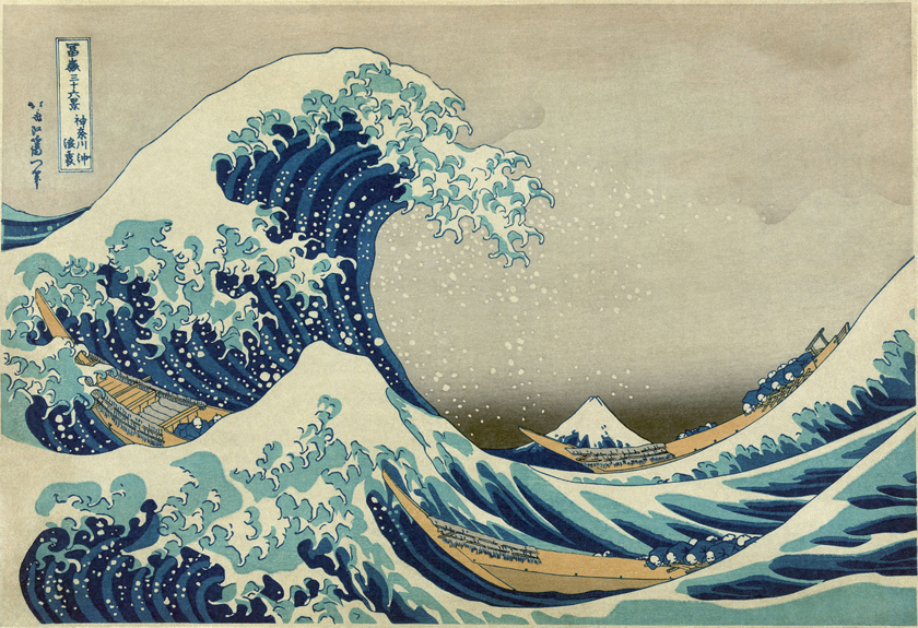
Let’s now take a look at the ukiyo-e print titled Great Wave off Kanagawa by Japanese printmaker and painter Katsushika Hokusai. This print is considered to be one of Hokusai’s masterpieces. Together with another print called Red Fuji, both of which were part of Hokusai’s landmark series called Thirty-six Views of Mount Fuji, The Great Wave as it is called in the West, would come to influence Western artists perhaps more than any other Japanese work of art. First published in the early 1820s and completed in the early 1830s when Hokusai was in his early 70s, the prints from this series would eventually circulate in the West after Japan opened its ports several decades later and would impact the work of Western artists considerably. For example, Dutch post-impressionist Vincent van Gogh would incorporate into his own paintings the same effective use of simple color and shape. As for French impressionist composer Claude Debussy, Hokusai’s The Great Wave in particular would be a major influence on his symphonic sketches, Le Mer. The impact of prints by Hokusai and other Japanese artists can not be over emphasized. They would become all the rage in Europe and were eagerly collected as works of fine art by artists Claude Monet, Edgar Degas, James McNeill Whistler and Henri Toulouse-Lautrec, to name just a few.
Some have commented on the fact that in Hokusai’s day, ukiyo-e prints were inexpensive, mass produced objects (costing about the same as two servings of soba noodles). While this is true for many commercially produced ukiyo-e prints, more expensive prints were also commissioned and collected by connoisseurs. In short, ukiyo-e prints have been and continue to be widely popular across all segments of Japanese society, highly regarded by many, and produced at all price-points.
Look closely at The Great Wave. What do you notice first? Its sense of vast space, perhaps? This is deceptive. The print is in fact small, only about 10 inches by 15 inches. Within its confines, however, Hokusai has shown the mighty and unpredictable forces at work within nature as well as a sympathy for man in the face of such forces. As he was fond of doing, Hokusai built up his composition with a bold geometry of circles or parts of circles and triangles. Can you see where in the composition that Hokusai used these geometries? The great wave that dominates the left hand side of the print forms a half circle, while the smaller wave in the foreground and Mount Fuji in the distance form triangles, each one echoing the other, deftly connecting the foreground to the background.
Let’s describe the details. Three long boats, each one powered by a crew, are about to be swallowed up by the turbulence of the sea. Boats such as these were a common sight in Hokusai’s day. Built to transport fresh fish each morning to fish markets in Edo (modern day Tokyo) from nearby fishing villages, crewmen such as these had to endure the forces of nature every day. At the time, Edo was the second largest city after London and had approximately one million inhabitants. One only has to imagine the amount of fish that boats like these had to haul along the coast every day. Here, the crewmen, tiny as sea foam, are sending their boats straight into the waves. In the distance, snow-capped Mount Fuji sits dwarfed by the waves and is seemingly about to be swallowed up by the sea. Each print in the series shows the mountain from different vantage points. The highest mountain in Japan, Mount Fuji last erupted in the early 1700s. Prized for its beautiful, symmetrical cone, which is snow-capped several months a year, it is one of Japan’s three holy mountains, which include Mount Tate and Mount Haku. As a sacred object of worship in Japan, Mount Fuji is linked with eternal life. As such, it has been a place of pilgrimage for centuries. The sacredness of the mountain stems from an ancient tale of a goddess, who in depositing an elixir of life at the summit, offers the mountain up as a source of immortality. Hokusai was known to be obsessed with the mountain and linked its source of immortality to his desire to live to a great age himself.
Does man nearly disappear from the scene yet battle on with an equal and seemingly potent force? Is there sunshine despite the sea storm? Does Mount Fuji appear serene and disconnected from the human struggle going on? Perhaps Hokusai is revealing how man, though governed by the laws of nature, must endure or perish on his own. Noteworthy is how the foam of the great wave seems to claw like a bird or clutch like a human hand. Indeed, Hokusai was fond of connecting the energy found in nature to the energy of man. Also noteworthy was Hokusai’s success in creating great tension in his composition. Can you see where? Beneath the great wave there is a large empty space. This provides a tension that is relieved in the mind of the viewer when he or she unconsciously moves the action forward and watches with baited breath as the wave crashes down directly onto the boats. One can’t help but ask oneself: “Will the crew make it to the other side? Will their boats capsize instead?” Hokusai has provided the viewer with a moment suspended in time. However, what impressed Western artists most about the print was Hokusai’s effective use of simple color.
Hokusai was an artist of immense originality. That he had a restless spirit as well is well documented—he changed his name (more than any other artist in his day) along with his residence and artistic style many times over the years. He also had little patience for others who did not live up to his artistic demands. Indeed, one anecdote from Hokusai’s early days as an artist tells of him being expelled from an established school of printmakers and painters, in part because he criticized the work of his superior. The story goes as follows. Hokusai was asked to accompany one of his superiors and a select number of artists on a mission to help repair the ruling family’s mausoleum. On their way, they stopped at a inn, and the innkeeper asked Hokusai’s superior to do an impromptu picture of a child picking a persimmon off a tree. The finished picture portrayed the child standing on tiptoe, even though the bamboo pole he was holding reached above the branch of the tree. Hokusai took one look and whispered to one of his companions that their superior should have shown the child stretching up but unable to reach the persimmon. Hokusai’s criticism reached the ears of his superior, who was furious, and Hokusai was told to return home alone. Soon afterward, Hokusai was expelled from the school.

Sunset Over Ryōgoku Bridge, Katsushika Hokusai, Japanese, c. 1830-1831
(color wood-cut)
Let’s look at another ukiyo-e print by Hokusai from his series. This one is titled Sunset Over Ryōgoku Bridge. Can you tell from this print that Hokusai identified with the common man? How so? Look closely at the figures. Hokusai showed average men and women engaged in the everyday activity of taking a ferryboat with a moving, at times humorous, but always unsentimental sympathy. He also portrayed his figures realistically. Indeed, Hokusai was a true master at presenting the human body at rest and in motion. As one scholar described: “Hokusai acquired a feeling for the movements of the human body and the emotional significance of particular postures or gestures, together with a remarkable ability to convey a sense of life, or a particular attitude or facial expression, with the utmost economy of line.” (Quote taken from Narazaki, Muneshige, Hokusai, The Thirty-six Views of Mt. Fuji, Kodansha, Tokyo, 1968.) His skill in this regard is indeed remarkable. Even when a figure’s face is hidden behind a hat, as can be seen in the figure nodding in the bow of the boat, Hokusai was able to present the look and feel of a real person. In short, his figures inhabit real landscapes and appear to breathe and move within them.
Let’s describe the many details. A ferryboat approaches the shoreline, while the sun sets behind the western bank of the river. The inky black of night falls over the city, while Mount Fuji, a deep-blue cone silhouetted against a ruddy glow, appears to rise over the horizon. How does Hokusai connect the different parts of his composition together? He connects the sky with the scene below by the vertical thrust of a fishing rod, which one figure in the ferryboat, perhaps on his way home from a day of fishing, holds firmly in his hand. How does Hokusai contrast this vertical line to other lines in his composition? Juxtaposed to this vertical thrust is Ryōgoku Bridge, which curves gently upward, tinged a dark green in the evening light. Does Hokusai repeat this curve anywhere in his composition? The curve of the bridge is echoed in the reverse curve of the ferryboat. The waves of the river lapping against the bank repeat this design element as do the circles of the umbrella, the straw hats, and more humorously, the top of the ferryman’s bald head. This repetition of line and shape and combination of colors, including blacks and indigos and greens, are masterful, making this print one of the masterpieces of the series. Hokusai has successfully portrayed the calm one feels at dusk when the physical exhaustion of a long day’s toil lay behind one and the quick pulse of nighttime activities lay ahead. One can easily imagine the figures in the ferryboat enjoying this welcome moment of rest, drifting languorously in their thoughts, while their boat rocks gently in the river’s swell.
One interesting anecdote from Hokusai’s life can perhaps can shed some more light on a man who was complicated to say the least and one whose life was a bit of a mystery. A ceremony was held at a famous Buddhist temple in Edo. At the ceremony, a statue of Kannon—a religious being of compassion—was being unveiled to the public. It is told that Hokusai astonished the crowd gathered at the temple when he painted a gigantic half-length picture of the Buddhist monk and first Chinese patriarch, Bodhidharma, on paper that was laid out beside the main hall of the temple. One witness described the enormous size of Hokusai’s picture as follows: “A horse might pass through the mouth and a man take his ease on one of the eyes.” Hokusai used sakè tubs full of ink and brooms for brushes to complete his performance piece. Yet, it was also said that Hokusai had an eye so sharp and technique so fine he could draw two sparrows on a grain of rice.
Another anecdote tells of the time Hokusai and another artist were summoned to the Asakusa Temple, at which the Shogun had stopped on his way falconing. The Shogun—the top Japanese military ruler—sent word to Hokusai and the other artist to come to the temple and produce works on the spot for his amusement. Hokusai is said to have arrived at the temple with a basket in his arms, which piqued everyone’s curiosity. He placed the basket on the floor and stretched out a long roll of paper on the floor. He drew a few dark-blue lines across the paper with a brush and then reached over to empty his basket. Inside was a common chicken. Hokusai coated the chicken’s feet with a brilliant red ink and turned the chicken loose on the paper. The chicken ran all around, leaving a trail of foot prints across the paper as it went. Hokusai bowed solemnly in front of the Shogun, uttering, “Autumn Maple Leaves Drifting on the Tatsuta River.”

Red Fuji Katsushika Hokusai, Japanese, c. 1830-1832 (color wood-cut)
Let’s look at one more ukiyo-e print by Hokusai from his series. This one is titled Red Fuji. One of Hokusai’s most famous works, the bold composition in Red Fuji is deceptively simple. How so? Hokusai created a picture of great effect with a minimum of detail. Indeed, the composition consists simply of mountain and sky against a pattern of clouds above and verdant lower slopes below. Let’s describe what details there are. Mount Fuji sits off center, with its right flank cut off and its left flank sloping gently downward. Is the shape of the mountain in the composition symmetrical or asymmetrical? Since the two sides of the mountain are uneven, the composition is asymmetrical. The asymmetry in the composition is key to the success of the print. Greatly prized in Japanese aesthetics, asymmetry offers the viewer tension as well as pleasure in its release. Tension is created specifically by the missing right-hand slope of the mountain, which is relieved in the mind of the viewer when he or she unconsciously replaces what is not there. Can you tell what time of year and day it is? The time of year is late summer as most of the snow caps have melted. What remains are narrow rivulets of snow unmelted in the gullies within the mountain’s flanks. The time of day perhaps is dusk, when the setting sun makes the mountain glow a deep red right before it is plunged into darkness. Or perhaps it is dawn, the moment when the sun appears over the horizon beyond the sea and flushes the top of the mountain in a rosy glow.
Describe the colors in the print. The print shows a bold yet deceptively simple use of color, in which there is a subtle gradation of only four colors—the red of the mountain, the deep azure of the sky, the white of the clouds, and the green patch of trees along the bottom. For years, it was an accepted artistic convention in Japanese art that the mountain was white. Hokusai showed it in whatever color it appeared to him at the time, whether white or black or red or blue. Hokusai interpreted color according to his own experiences and feelings. In this, Hokusai rescued nature from prettifying and convention and brought it directly into the realm of realism and then expressionism. Such bold use of color would directly influence Dutch artist Vincent van Gogh as well as many other artists in the West. Indeed, in Red Fuji, Hokusai anticipated the use of color in the modern sense.
In this print, Hokusai and his printers helped to make famous the woodblock printing effect called bokashi or color gradation. Hokusai’s printers created bokashi in Prussian blue to give a strong horizontal fade across the print to create a dramatic strip of sky at the top. Prussian blue was a pigment newly imported into Japan and was known for its intensity as well as the strong and translucent tones that could be produced when it was mixed with other pigments. Hokusai’s printers were able to achieve the effect of a gentle gradation of color or fade by applying a small amount of pigment on the woodblock and then applying a thin but uniform layer of water with a dampened cloth next to the pigment. By mixing the pigment with the water from the dampened area with a brush, the printer was able to create a gentle gradation of color. The range in blue from light to dark and pale to deep gave the suggestion of sky and opened up the composition to a feeling of vast space. It may just be me, but the bokashi in Red Fuji gives me a feeling that is at once intense and bittersweet, equal to the feeling I get from any real landscape—colorful sunset and rosy dawn alike.
Here is another anecdote from Hokusai’s life. It tells of the time Hokusai was taking his meals at the home of a famous novelist. The novelist was a compassionate man. He knew that Hokusai did not have enough money to pay for a service to honor the anniversary of his mother’s death. The novelist was generous and gave Hokusai a sum of money wrapped in a fold of paper. A few days later, the novelist was shocked when Hokusai came to his house and drew from his pocket the same fold of paper, now empty, and blew his nose into it and threw it into the trash. The novelist demanded that Hokusai tell him what he had done with money. Hokusai informed his friend that he had got a good meal and something to drink with the money. According to Hokusai, the best way to honor his mother was not to pay for a service at the anniversary of her death but to make sure that he lived to a ripe old age himself.
§
Hokusai brought a new depth to printmaking and art making in Japan with the publication of Thirty-six Views of Mount Fuji, which because of its success ended up being forty-six views, not thirty-six as originally published. Let’s review. What innovations did Hokusai introduce? The relationship between man and nature was a new one in Japanese arts. In short, in Hokusai’s prints the forces within man and nature were shown to be equally vital yet interconnected. To fully comprehend this innovation, one must understand the atmosphere in which the artist worked. In addition to a new interest in travel in Japan, there was a burgeoning interest in the scientific observation of nature. Nature was now seen as an independent force governed by the same rules that governed man. Hokusai would seize upon this conception of nature and reveal it, if not in a scientific manner, at least in a more realistic manner. Thus, in Hokusai’s hands nature was shown to possess a palpable physical reality and a source of energy that echoed man’s as well as his own artistic energy and creativity. Perhaps that is why his waves clutch like a human hand and his clouds spiral outward with a force that is at once independent from man and an essential part of him.

Katsushika Hokusai, 1839 self-portrait
Key to his success was the mastery with which he portrayed the human figure and nature through long years of careful observation, study and practice. Of particular interest in this regard are his many volumes of compositions in his titled work Sketchbooks, which he worked on tirelessly for many years. To prepare for Thirty-six Views of Mount Fuji, Hokusai traveled to remote country districts particularly around Mount Fuji and exposed himself to the countryside in all its moods. He recorded all that he encountered. His concerted effort in this regard can be seen in the strength of line and attention to detail, in which he was able to capture the momentary sense of time and life in figure and landscape. In addition, Hokusai championed a modern sense of the landscape as a valid subject in art. Although most of the prints in this series contain human figures, if one were to remove the figures, the prints could easily stand alone as fully developed landscapes. In several compositions, moreover, Hokusai abandoned the human figure entirely. Lastly and equally notable is the way in which Hokusai described the life of the common man realistically and sympathetically but without any ounce of sentimentality. Indeed, that Hokusai rejected any form of sentimentality is key to the enduring nature of his series and one that I particularly appreciate.
Towards the end of his life, Hokusai would write to his publisher and complain that he did not have enough clothes to keep him warm in his old age. Along with the letter in which he asked his publisher for money, there was a picture of a mendicant priest begging for alms. In this very same letter, however, Hokusai expressed his ambition to achieve more artistically. It is told that on his deathbed, he asked for another ten years, if not ten, then five, so he could become a true artist. Hokusai’s energy and ambition can be summed up in his own words: “From the age of fifty I began producing works that won some reputation, but nothing I did before the age of seventy was worthy of attention. At seventy-three, I began to grasp the structures of birds and beasts, insects and fish, and the way plants grow. If I go on trying, I will surely understand them better still by the time I am eighty-six, so that by ninety I will have penetrated to their essential nature. At one hundred, I may well have a positively divine understanding of them, while at one hundred and thirty, forty, or more I will have reached the stage where every dot and every stroke I paint will be alive. May Heaven, that grants long life, give me a chance to prove that this is no lie.” (Quote taken from Nagata, Seiji, Hokusai: Genius of the Japanese Ukiyo-e, Kodansha, Tokyo, 1999.)
Hokusai would live to the age of eighty-nine. During his long career, he would reach great heights of artistic mastery, innovation and popular acclaim. Towards the end of his life, however, he would witness his work fall into disregard, as fans turned away from what seemed to them at the time as old-fashioned. Instead, fans would embrace the work of Hokusai’s rival—the younger print artist, Utagawa Hiroshige, whose masterful series titled The Fifty-three Stations of the Tōkaidō had become vastly popular. Thankfully, posterity has been kinder to Hokusai and his art. Today, both he and Hiroshige are regarded on equal footing as two undisputed masters of the Japanese print.